Capture One Tooltips
Learning the ropes of Capture One from the get-go
The starting point for this initiative was a puzzling statistic in our BI dashboard; about 80% of the users who downloaded Capture One and began their free 30 day trial only opened the application on the first day – never to return again.
In our quest to uncover why the trial users were leaving before they had given the application an honest chance we ran a survey among several hundred recent trial users. Sifting through the survey responses to look for patterns two clear insights appeared; The users had trouble (1) understanding where to find the tools and (2) understanding what the tools do.
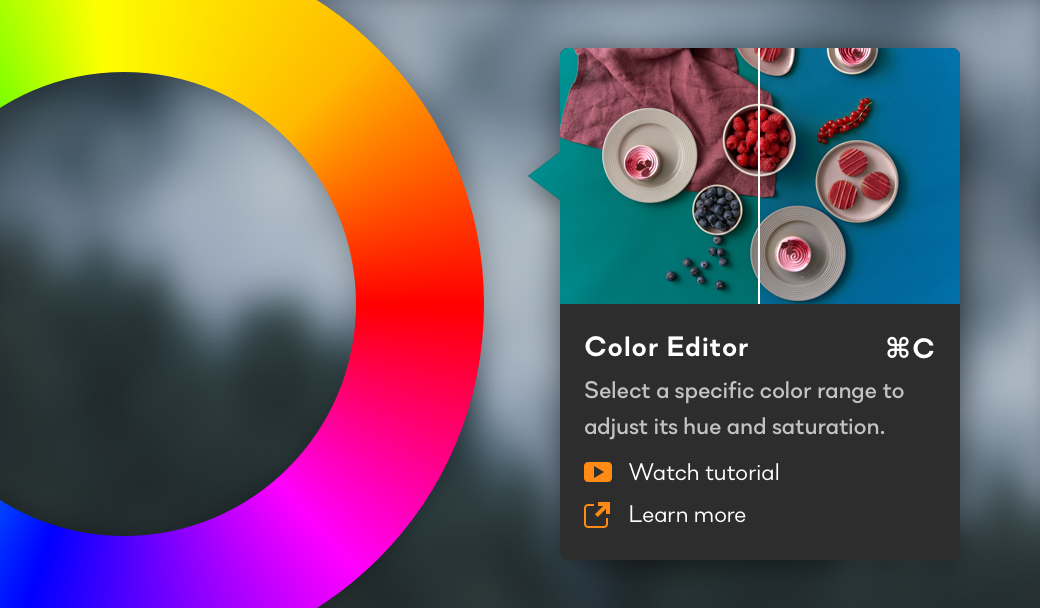
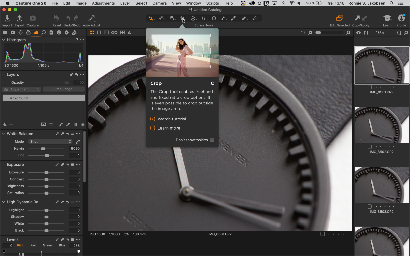
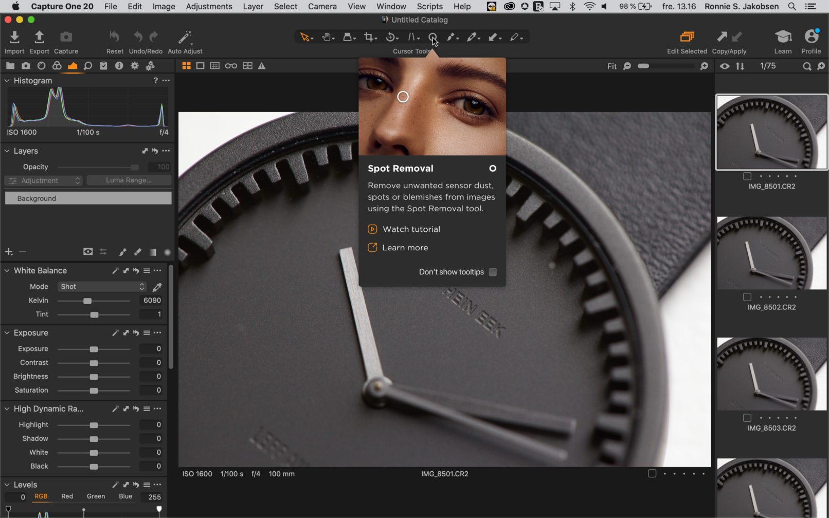
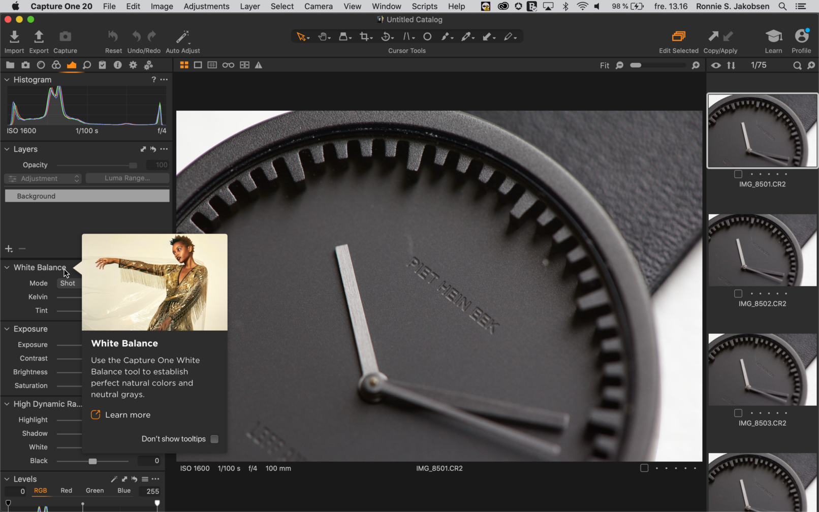
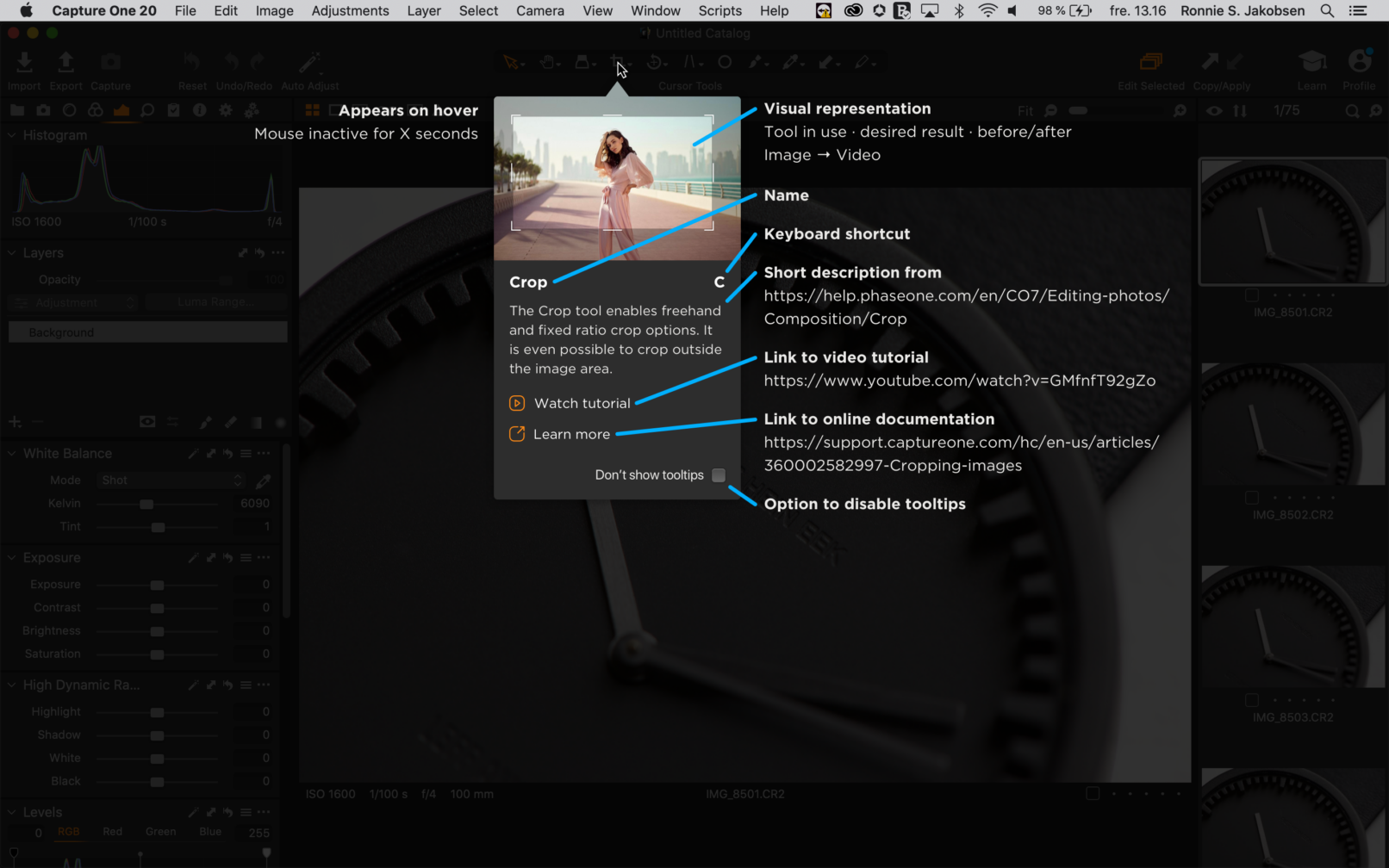
The purpose of the Enhanced Tooltips – as they came to be known – was thus to briefly explain what each individual tool would allow the user to achieve by means of a short description along with an illustration where appropriate. In additionally the tooltips would provide a link directly to the online support page for the specific tool together with a link to an ultra-brief tutorial showing the tool in use.
Aligning ambitions and expectations with the dev team early in the process resulted in a flexible and scalable framework allowing for a wide variety of content to be displayed and for frictionless localization. The content received plenty of TLC over many iterations and resolute teamwork between many internal stakeholders before finally being ready to concisely enlighten the end-users.
At the end of the day the total count of tooltips implemented was no less than 154! Finally the interface of Capture One – which is said to be daunting and hard to wrap your head around at first – provides an easily accessible and digestable way of learning what each and every tool does.
Employer
Role
- UX/UI Designer
Design Methods
- Competitive analysis
- High fidelity mock-ups
- Prototyping
- Workshop
- UX writing
Conceptual Mock-Ups
Initial mock-ups to manage expectations with stakeholders
Anatomy of a Tooltip
Annotations on a mock-up detailing the general format and content of a tooltip
Promotional Video
Made for the release of Capture One 21
In-App Feature Demo
Tooltips appear when hovering the cursor tools in the toolbar
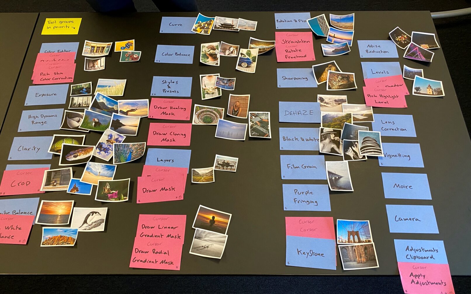
Illustration Workshop
Outcome after discussing and deciding which images would best illustrate the effect of each tool
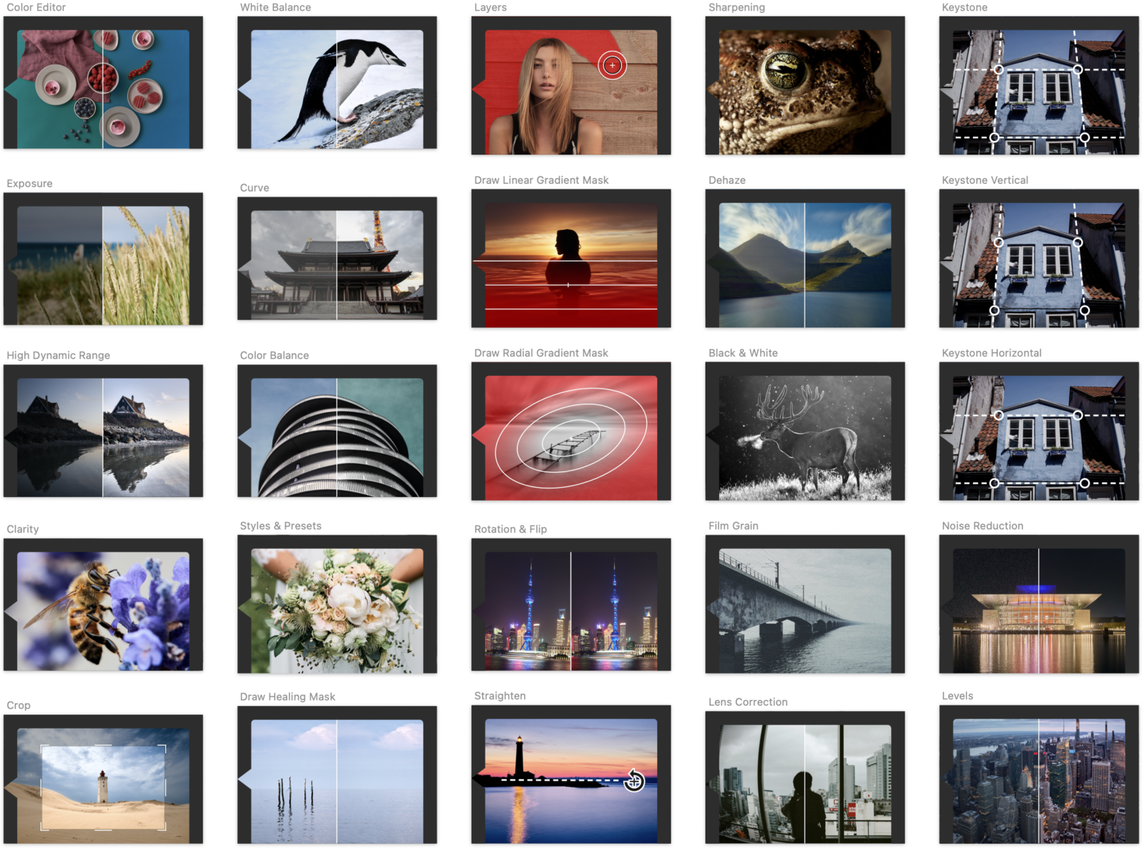
Final Set of Illustrations
The photography was sourced from the talented photographers among the employees of Capture One
