Danmarks Indsamling
Good deeds and great results exhibited
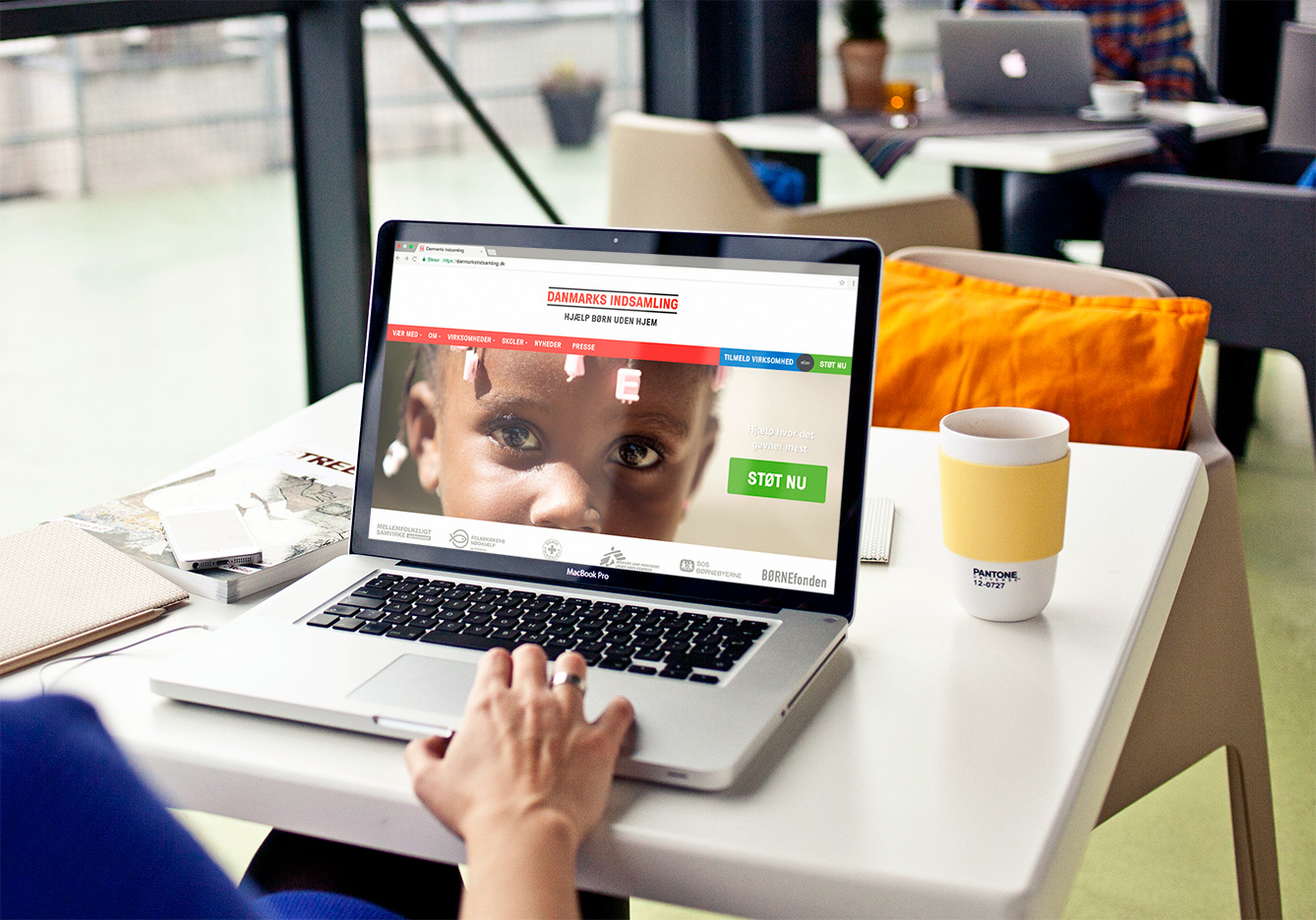
As the primary driver behind the Danish charity event Danmarks Indsamling Kommunikationsbureauet København is also responsible for communicating all the good deeds which are made possible by the collected money. Despite its central role in fulfilling this purpose the website had, however, become disorganized and cluttered over the years. Thus, Kommunikationsbureauet København asked Plant for help with redesigning the website and cracking this classic information architecture case.
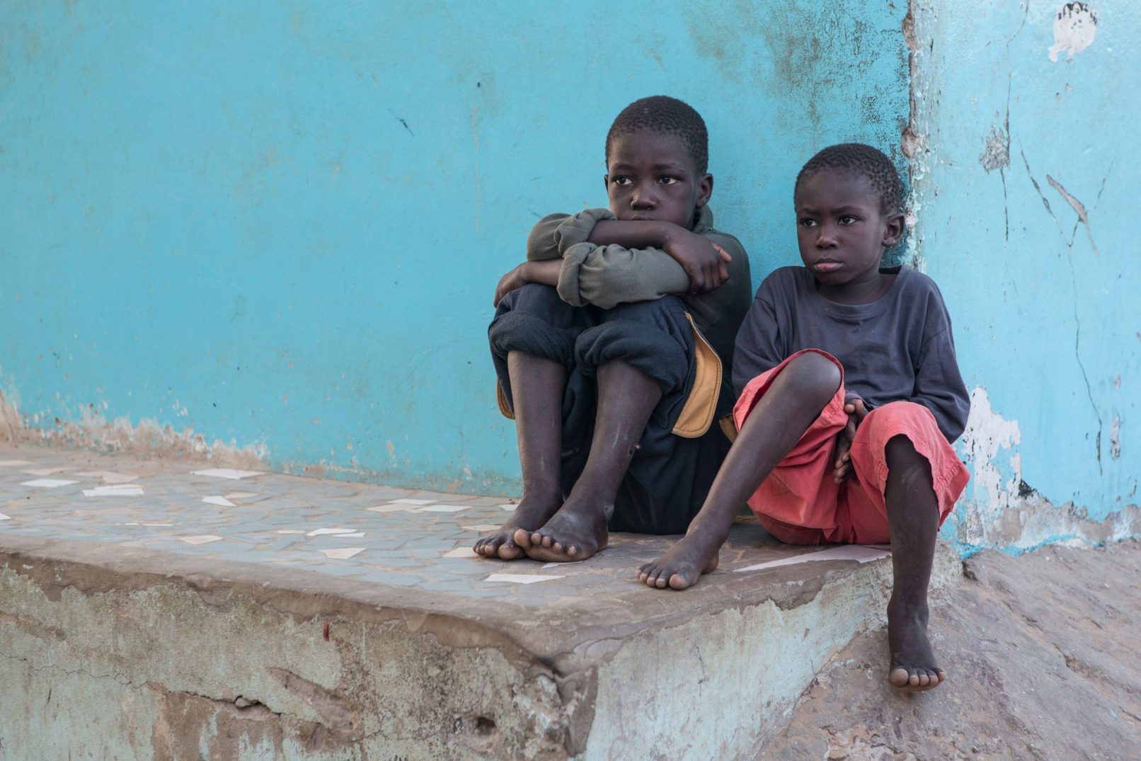
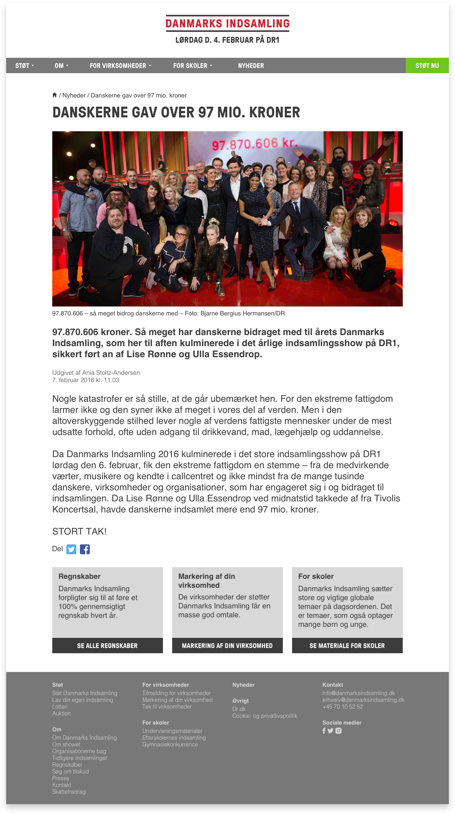
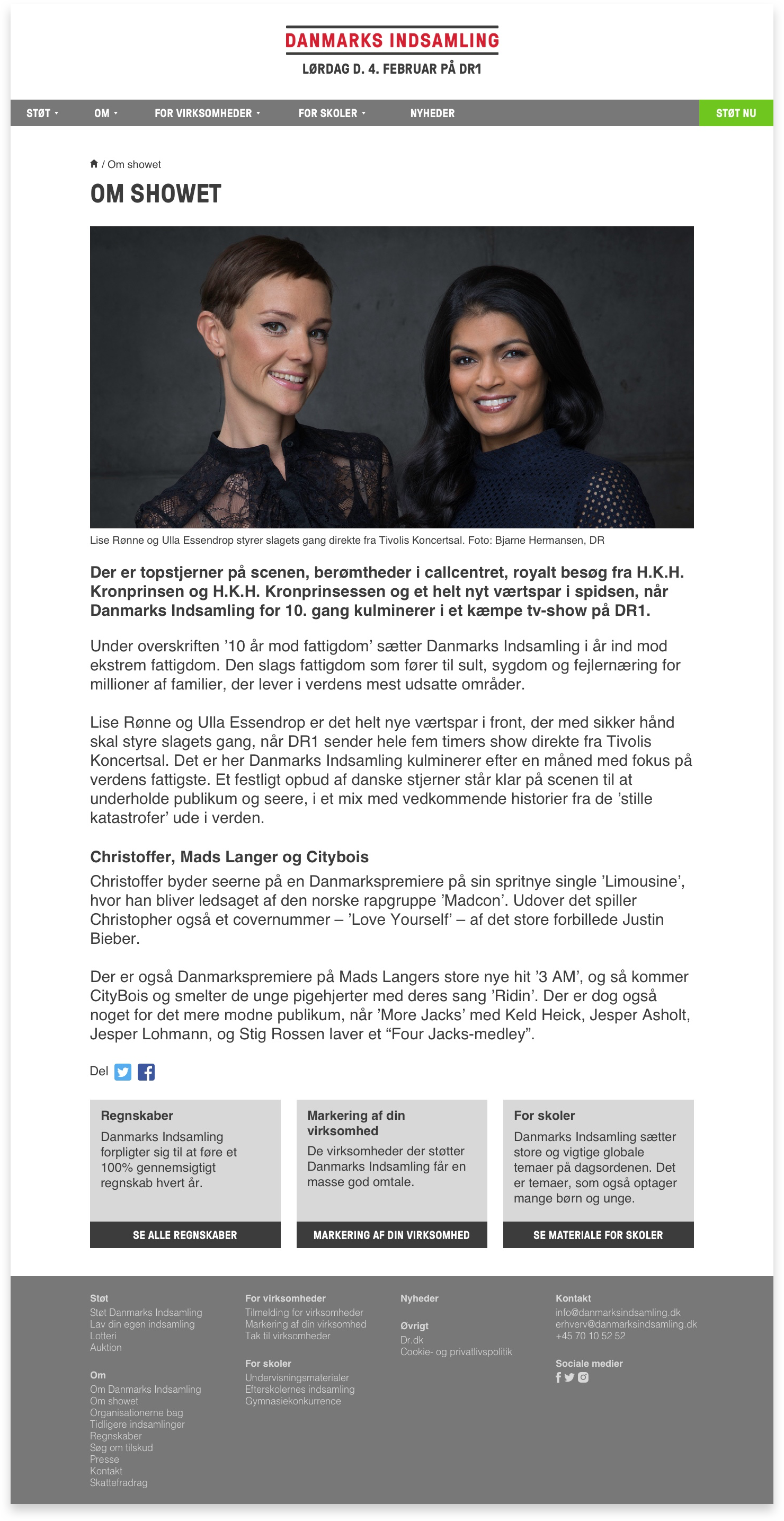
Transparency is an extremely important aspect for a large non-profit charity such as Danmarks Indsamling. Not just transparency in their financial accounting but also in their social and societal impact. We wanted to make that clear by bringing forward the many pictures from the charitable projects which had been funded by past events. We also enhanced the reading experience of the project articles by applying best practice legibility rules and created many rich text formatting options for the editors to spice up their writing.
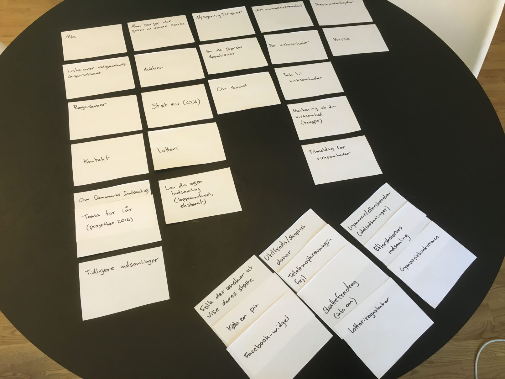
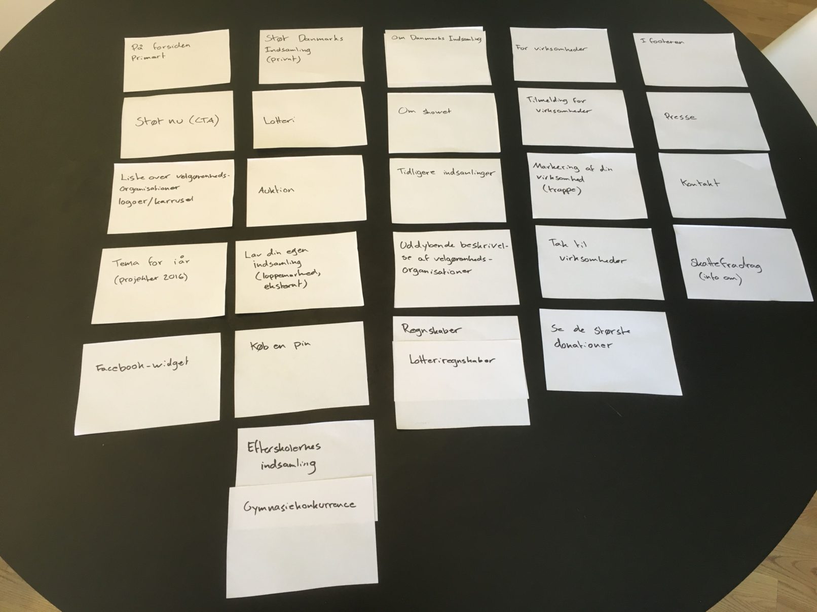
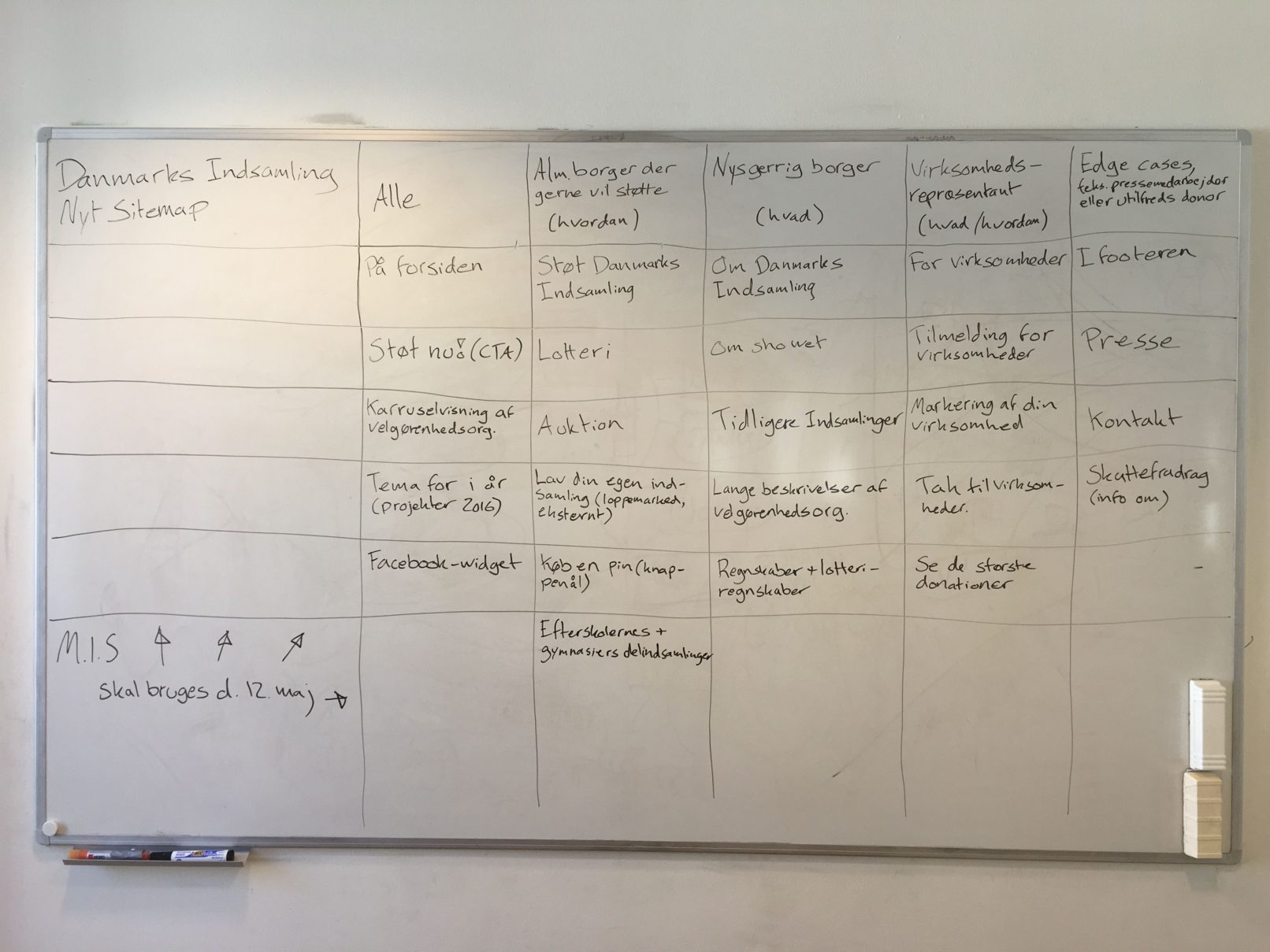
Creating order from a large pile of uncategorized information can be an overwhelming task, but the method of card sorting makes it both fun and manageable. After multiple rounds of juggling around with the information a clear pattern emerged and ultimately became the overarching information architecture of the new site.
Role
- UX Designer
UX Methods
- Sketching
- Wireframing
- Prototyping
- Card sorting
