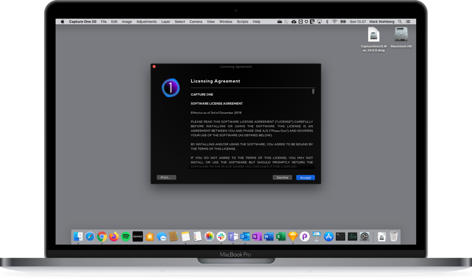
Capture One Onboarding
Your photography is about to evolve
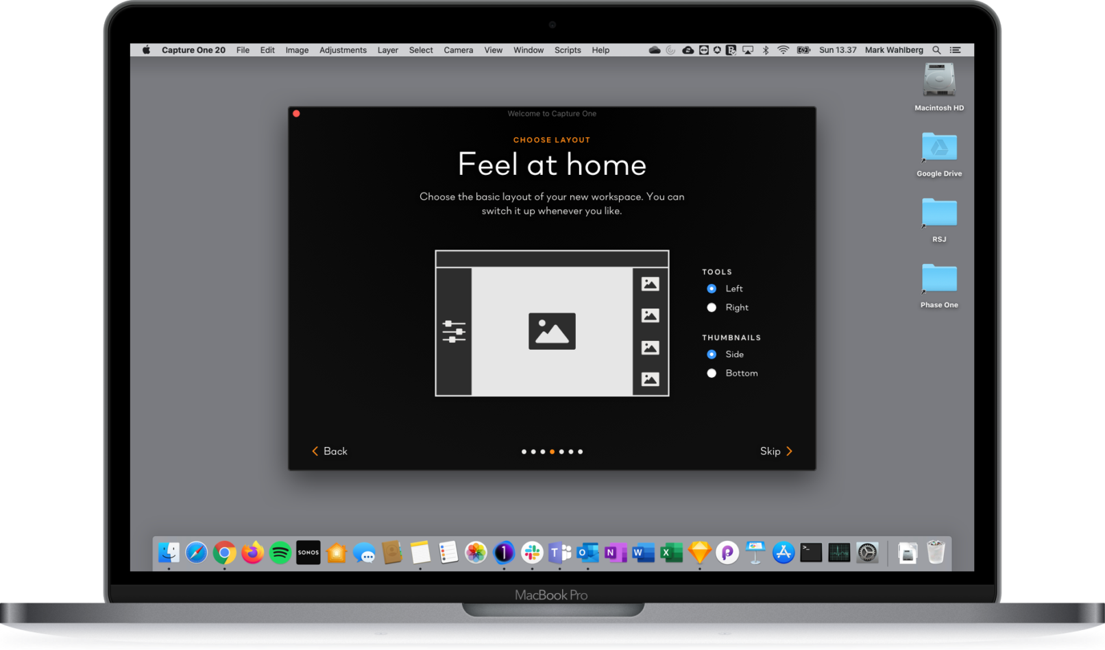
Making a compelling and memorable first impression is important when you’re trying to convince a trial user that your product is worthy of their hard-earned money. *Enter the new Onboarding Flow of Capture One.
So, how do you know your users are not impressed after experiencing your product for the first time? At Capture One the analytics made it clear that more than 80 % of the people who downloaded a free trial only opened the app once and never returned.
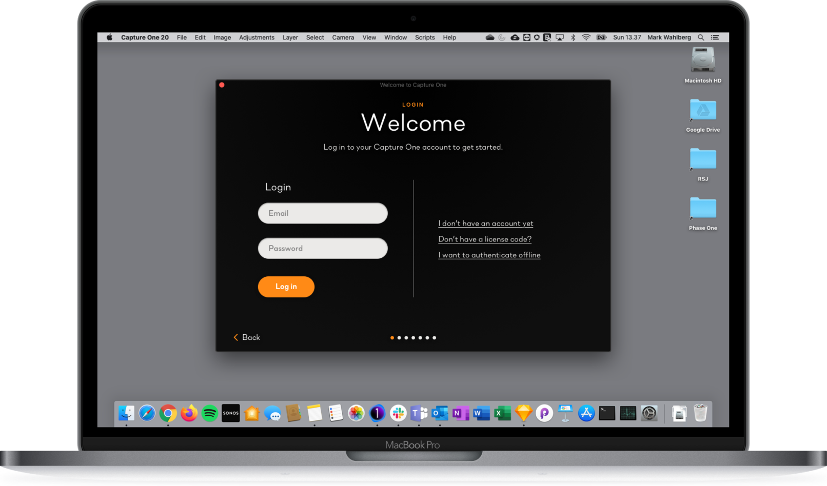
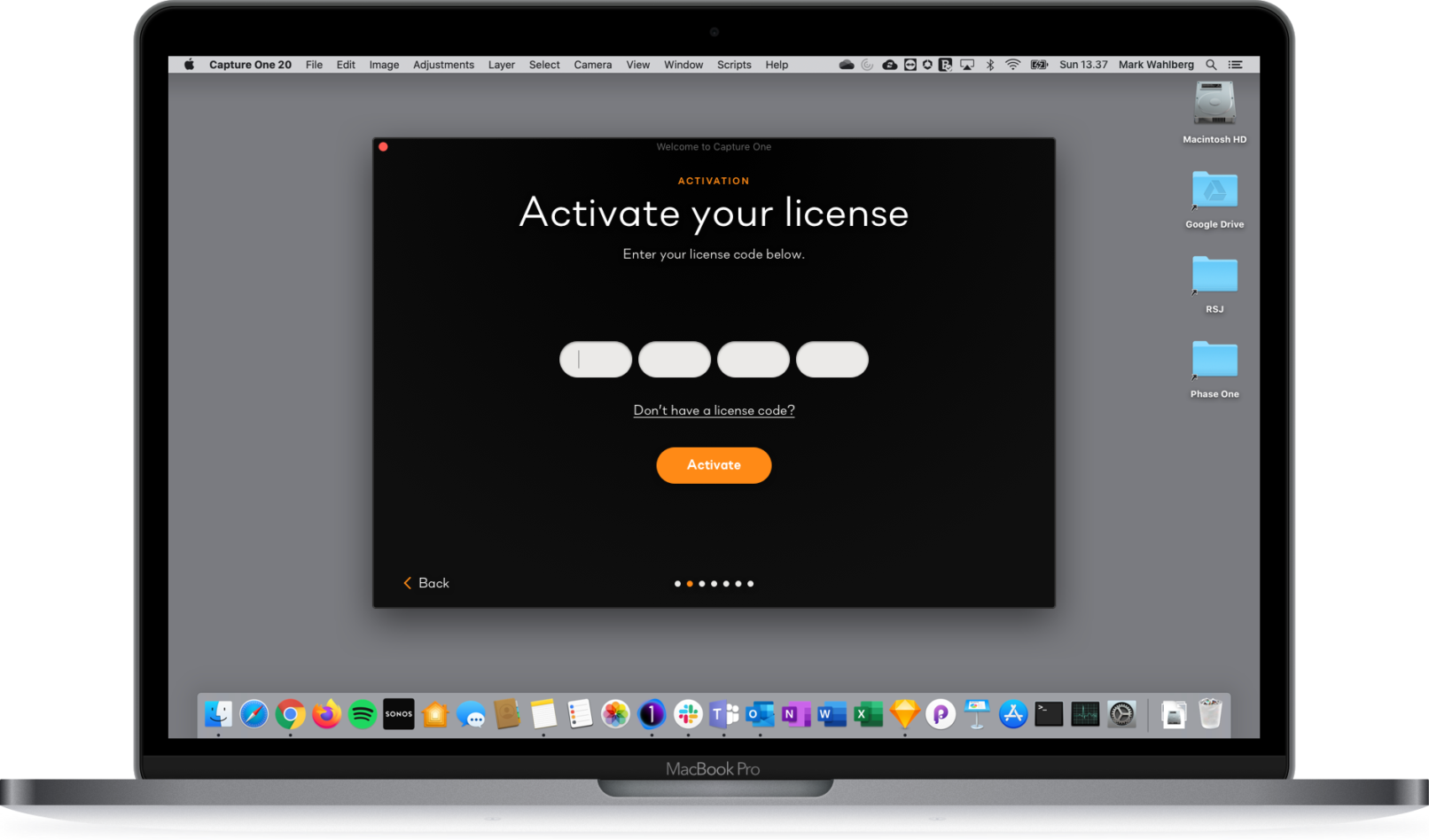
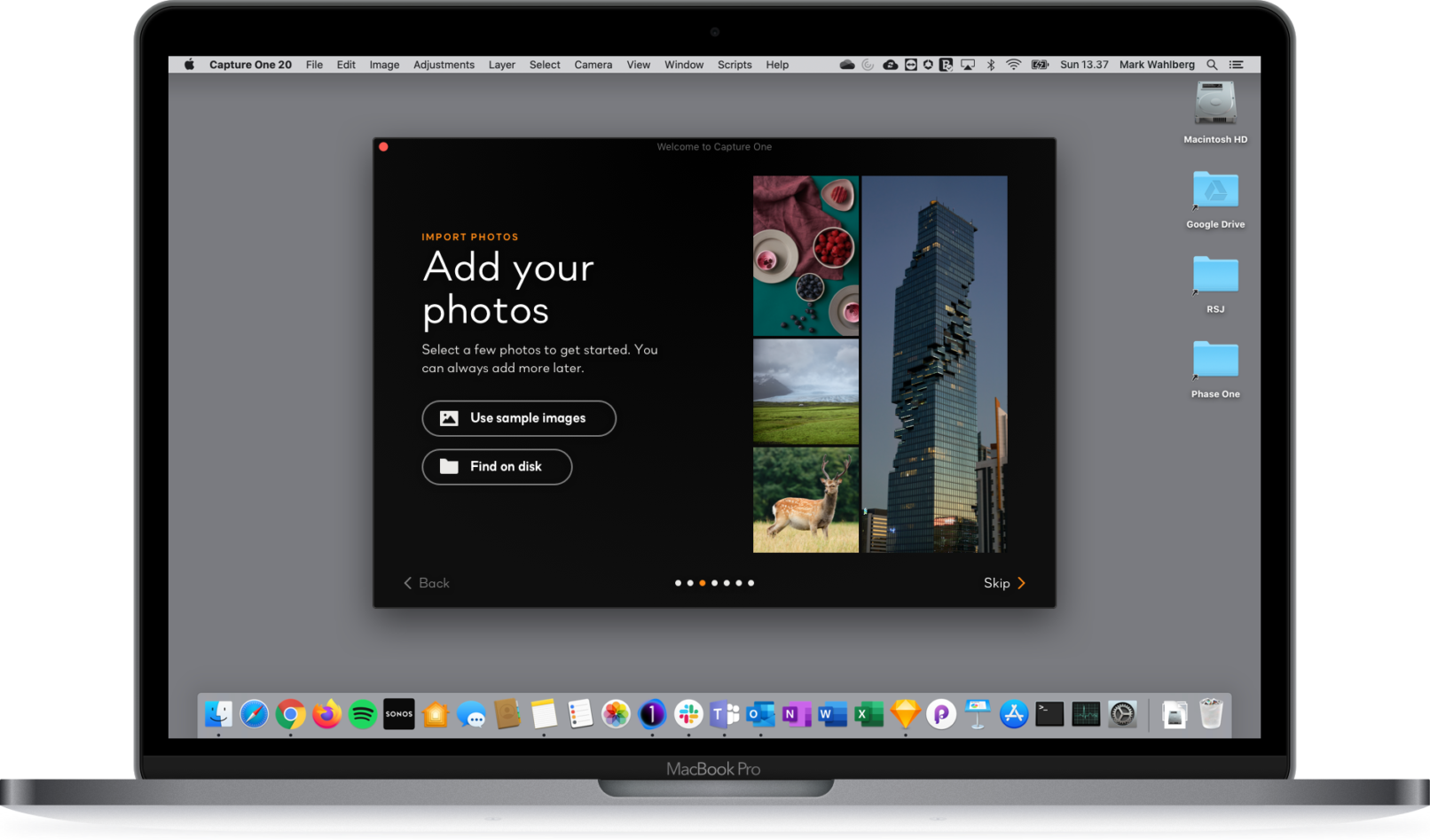
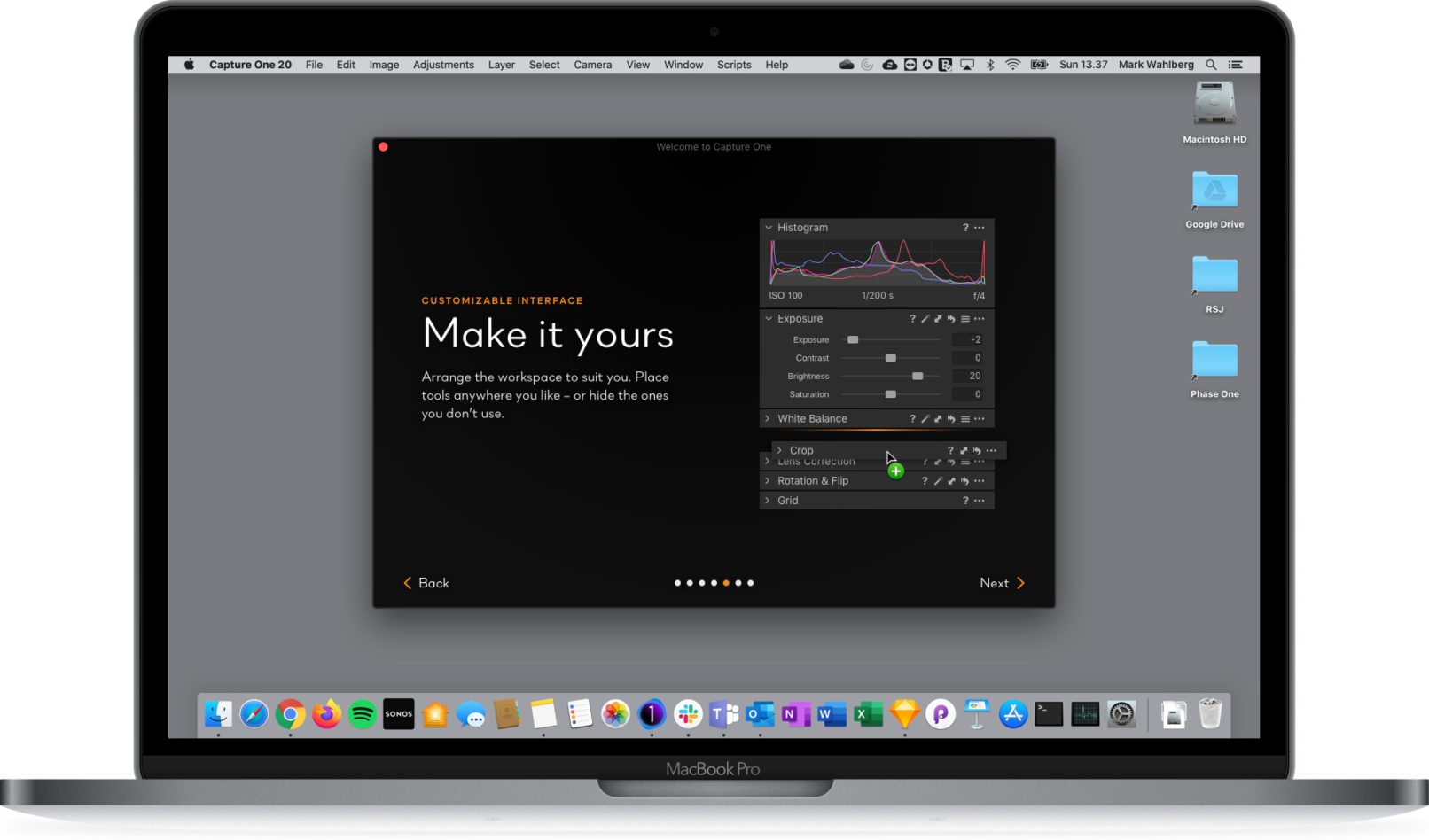
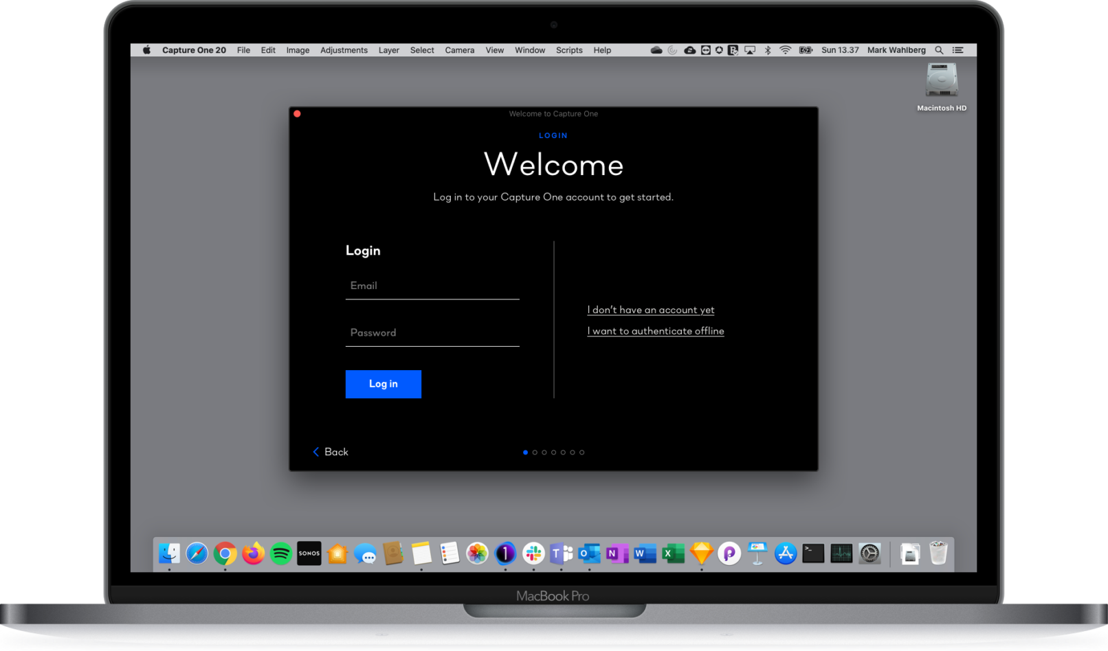
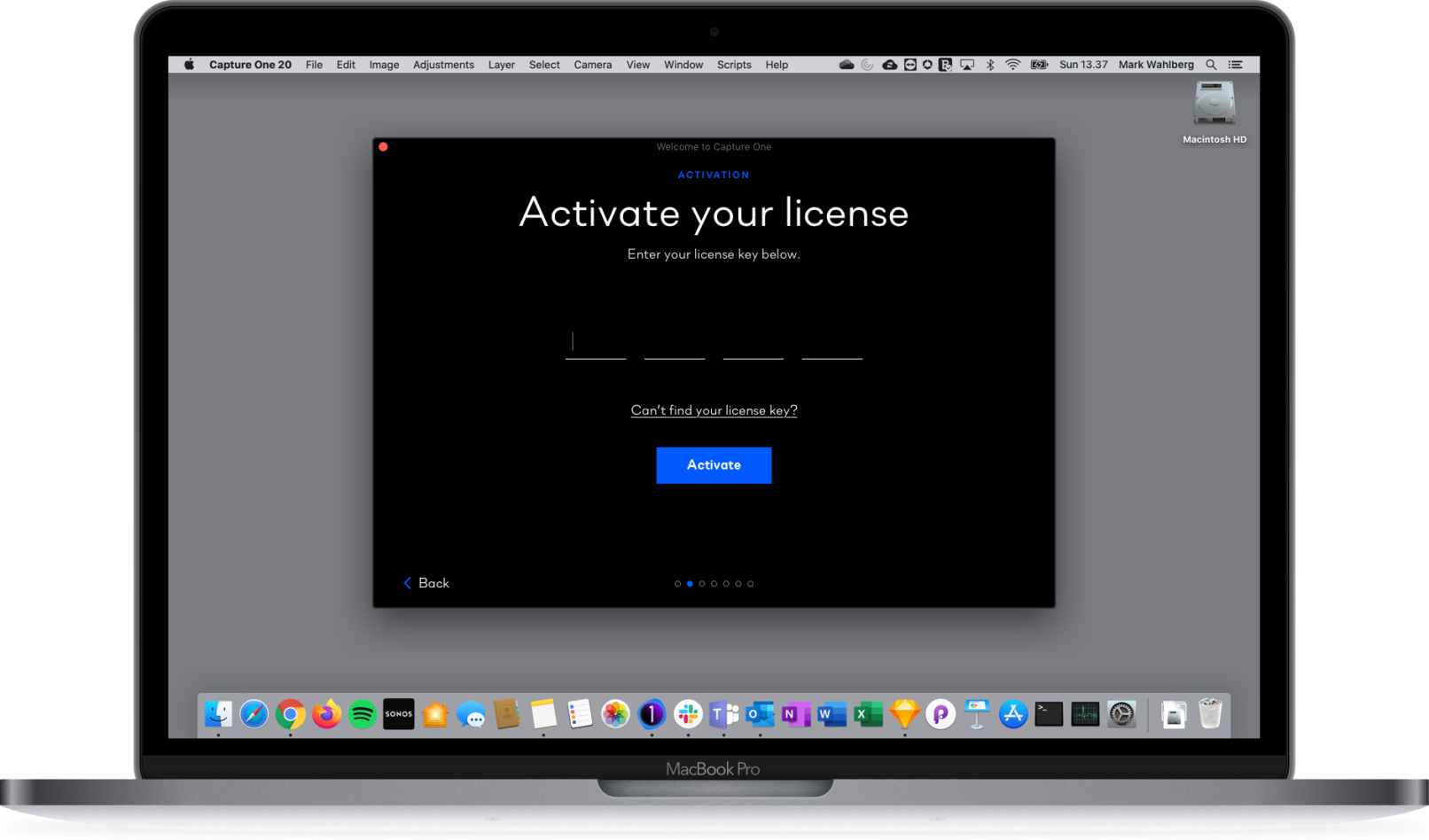
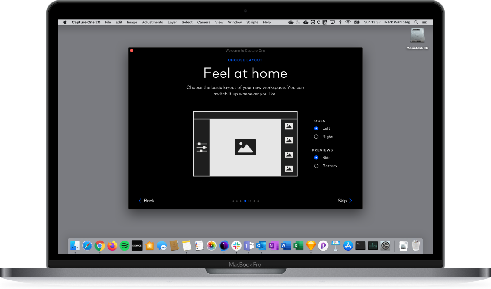
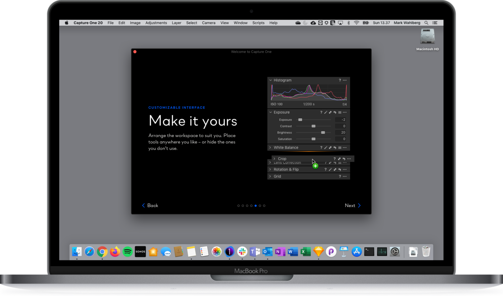
The reason for introducing an Onboarding Flow, then – apart from its functional value of letting the user log into their account without friction and customize their brand new workspace to their liking – was to appeal to the user on an emotional level.
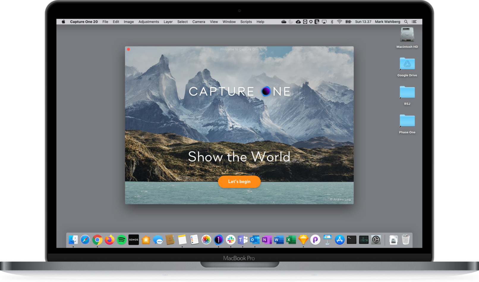
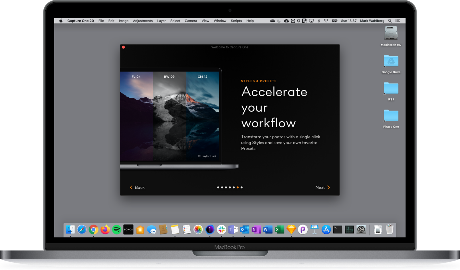
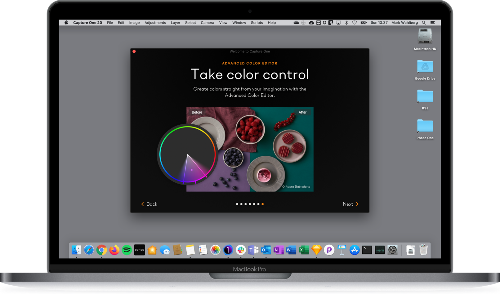
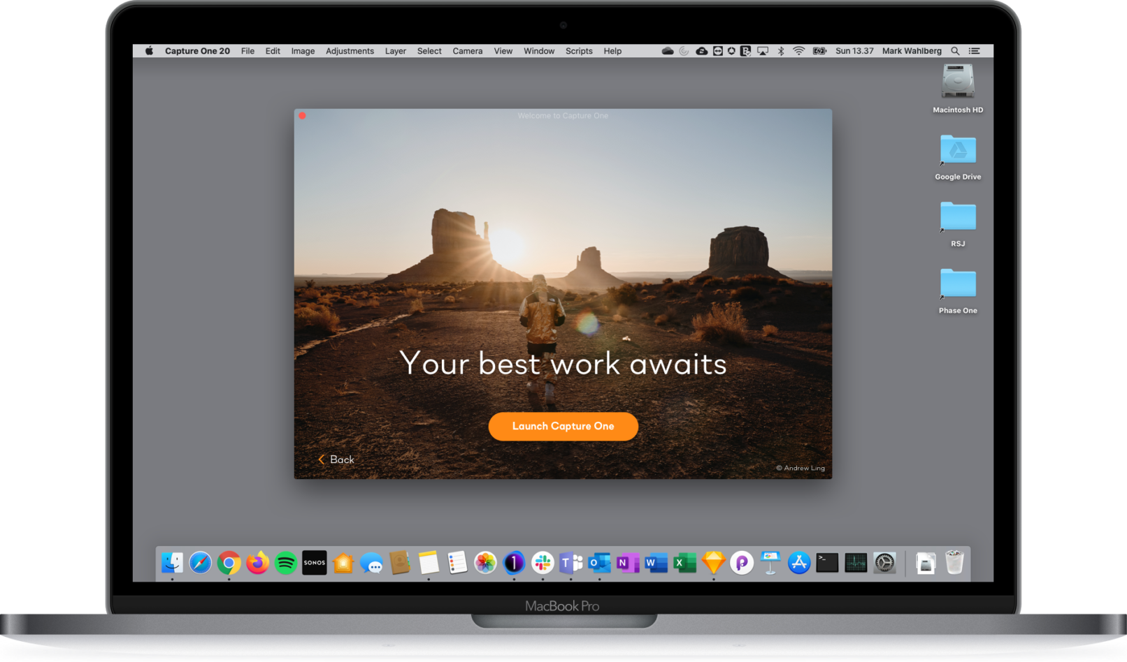
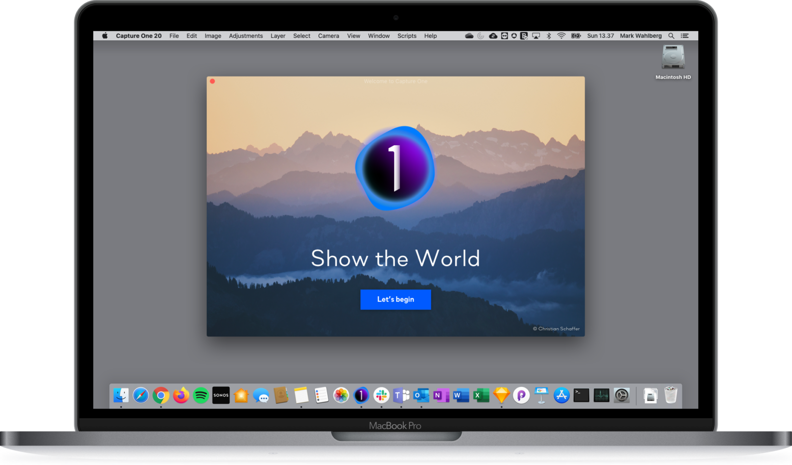
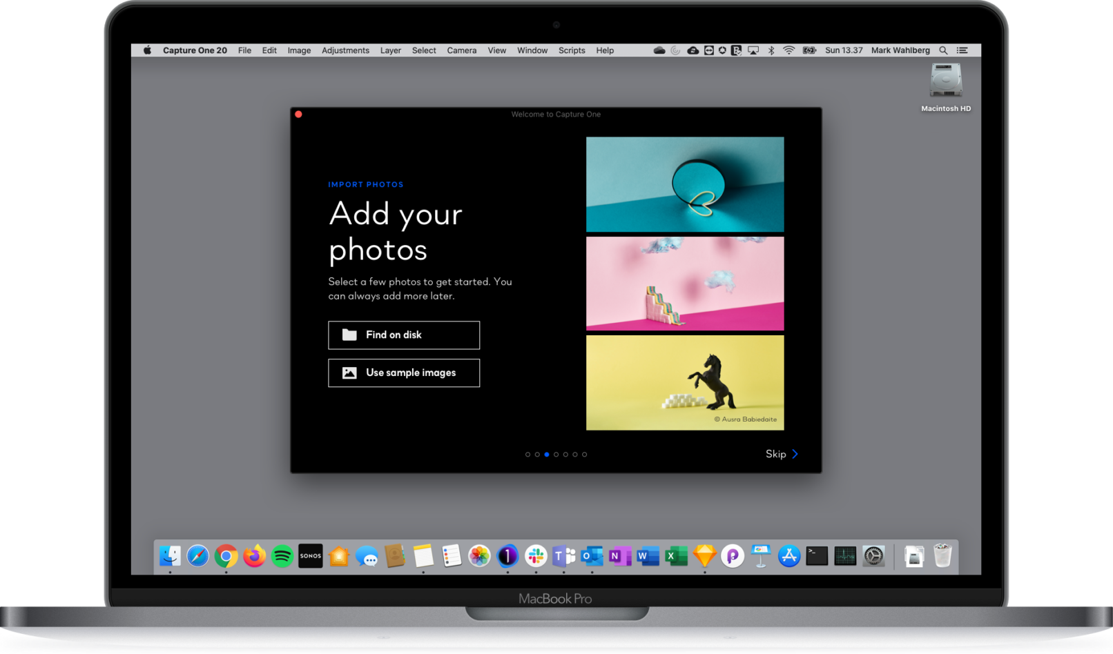
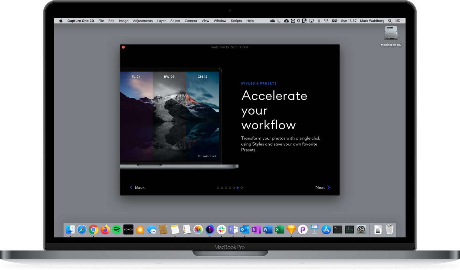
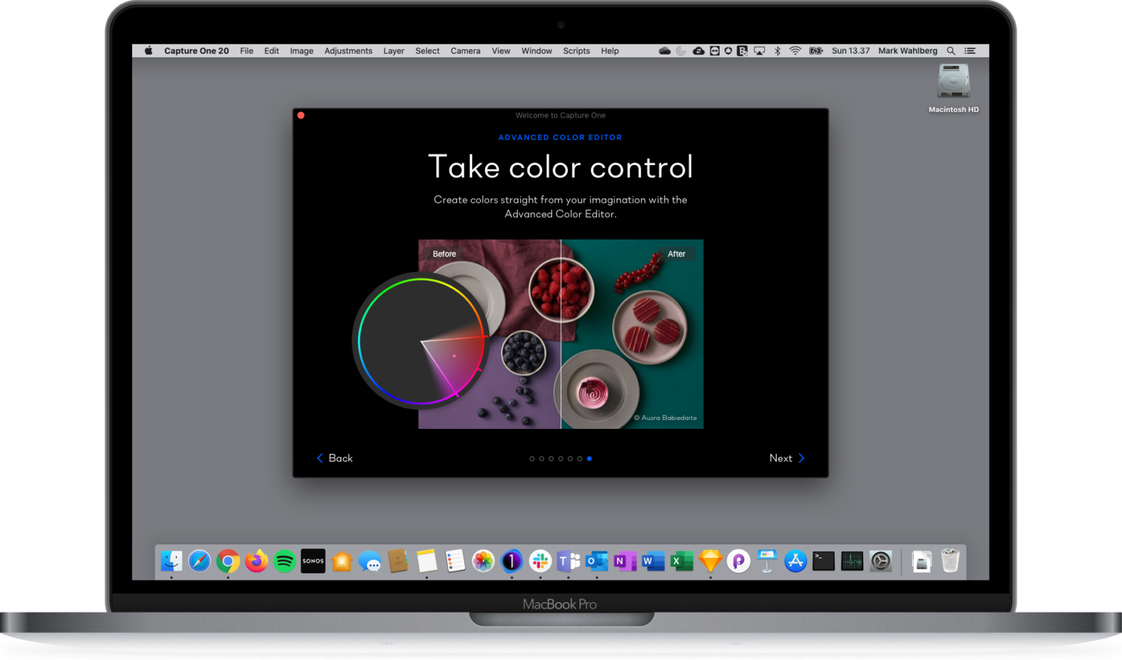
Following the proverb “show it, don’t tell it” the Onboarding makes heavy use of beautiful photos which have been edited with Capture One to demonstrate what the application is capable of.
The implicit message we wanted the users to take away was this: “The application you are about to experience is powerful, flexible and has the potential to elevate the quality of your photography to the next level.”
Employer
Role
- UX/UI Designer
Design Methods
- High fidelity mock-ups
- Prototyping
- User testing
Final Design
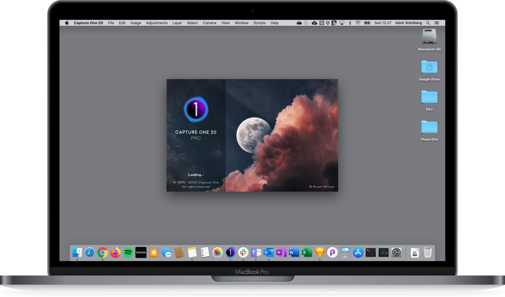
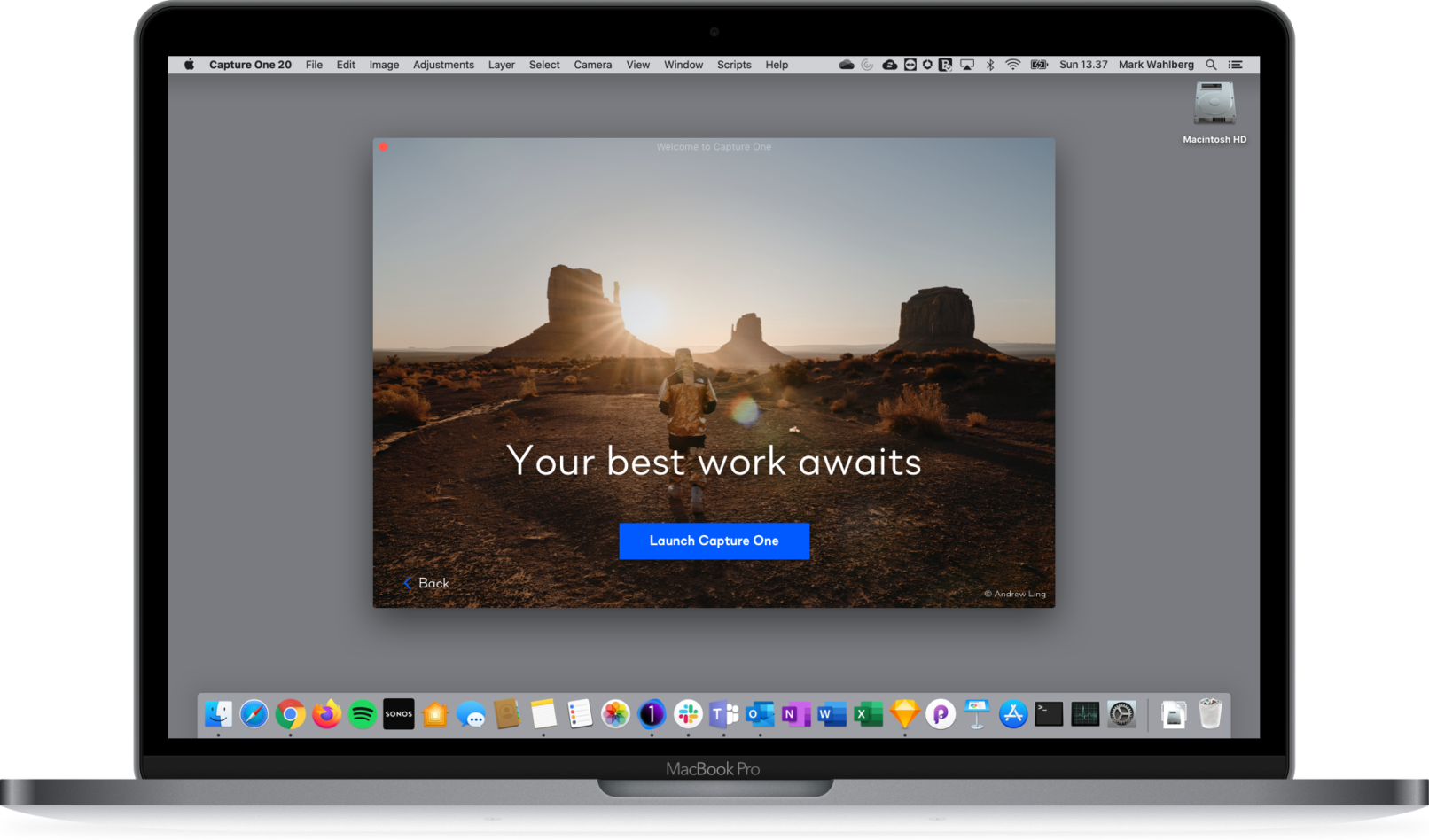
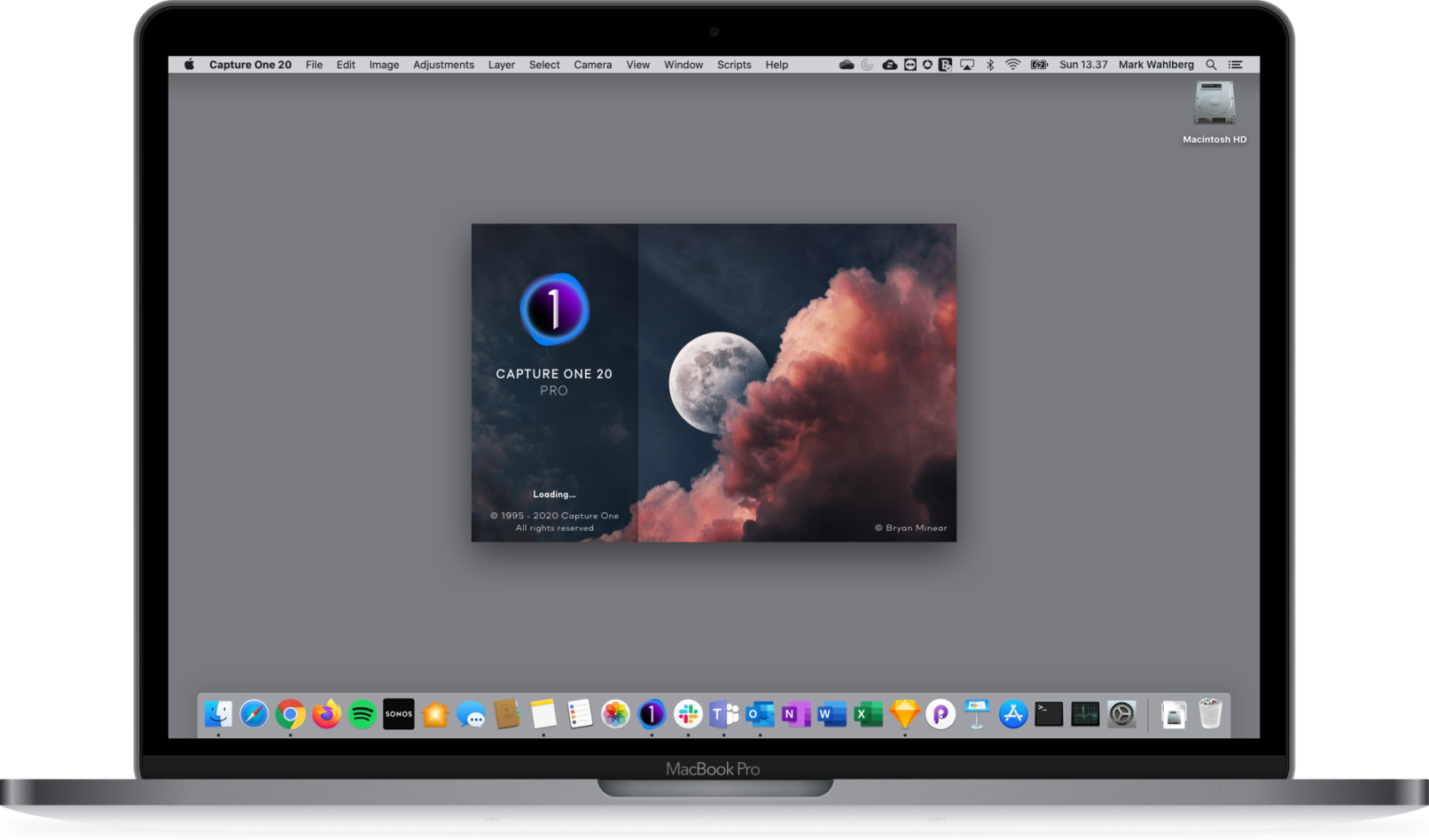
The Onboarding Flow released in Capture One 20.1
Flexible & Scalable
The Onboarding Flow reskinned to fit a new CVI
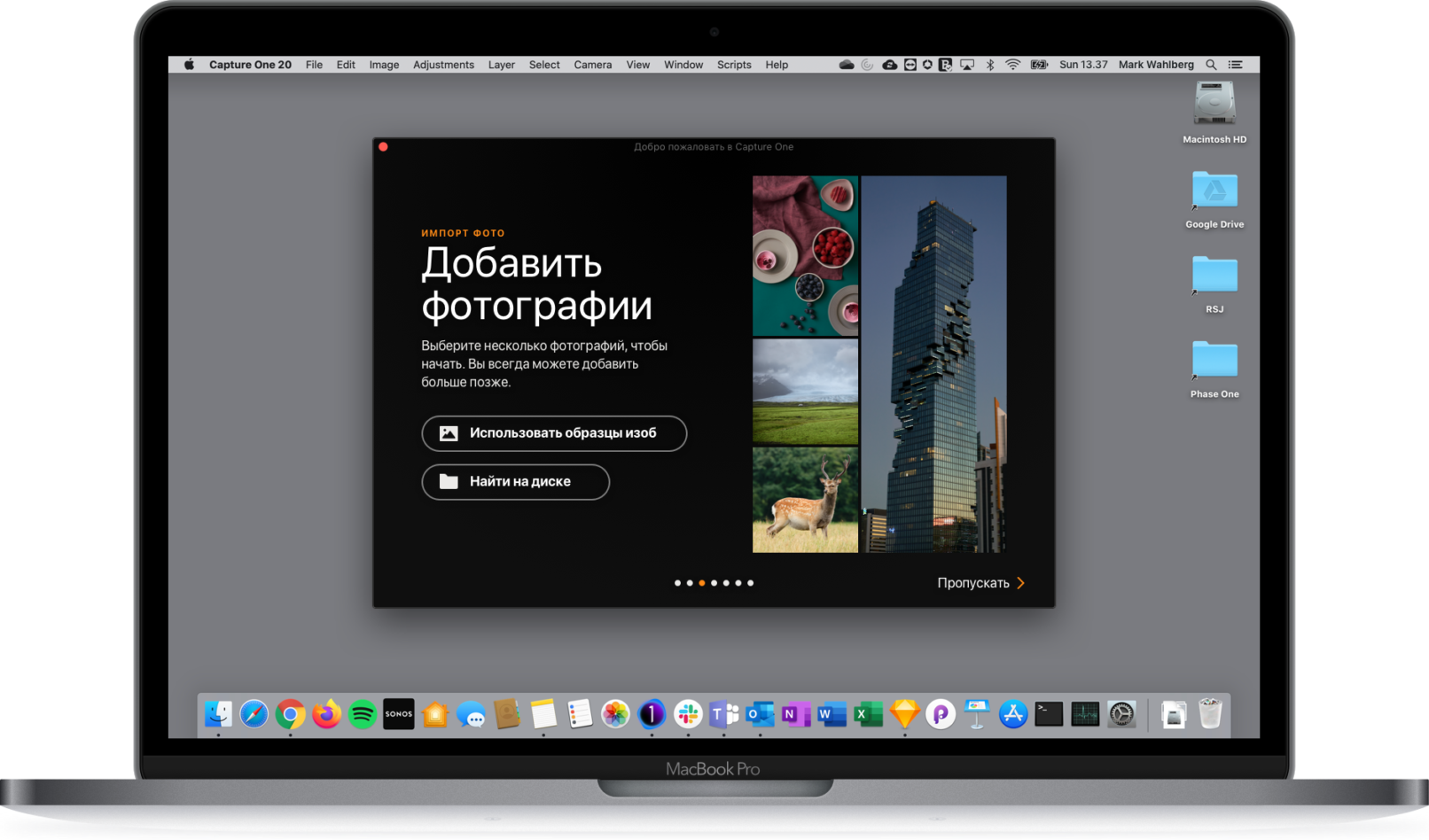
Capture One comes in 14 languages
User Test Highlights
Key findings from interviews and usability tests with 5 photographers
