YouSee Instant Assistance
Moving from obtrusive to friendly with a 100% performance increase
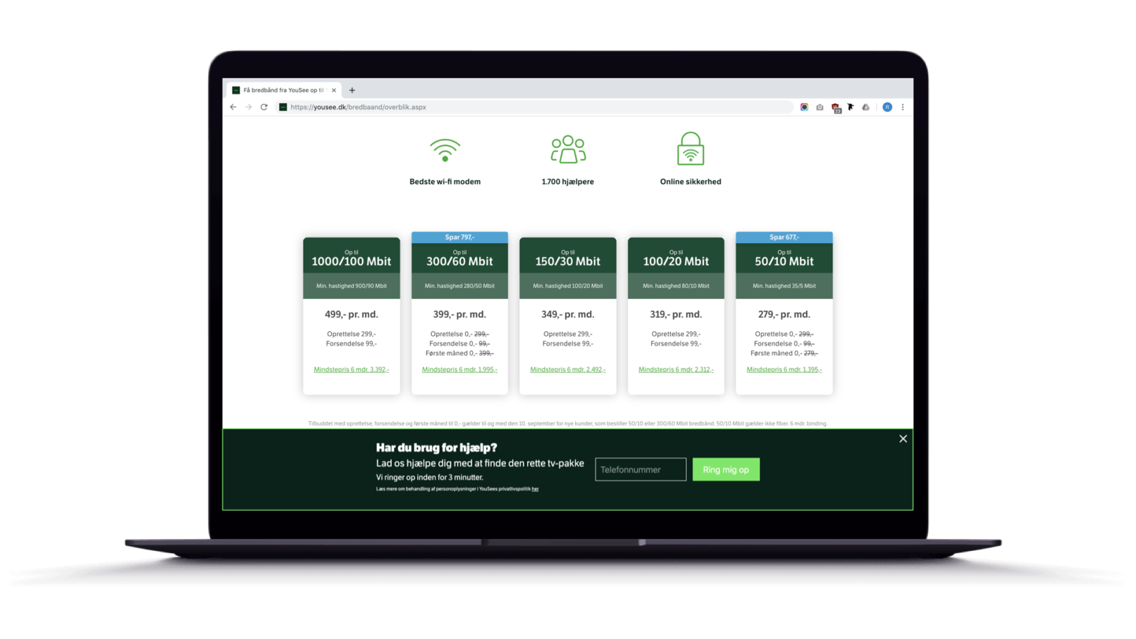
Challenging a bad design that performs well can be tough gig in a massive telco. Nevertheless I set out to replace the ubiquitous, obtrusive and dated popup banner asking the user whether they would like to receive an instant phone call from customer support.
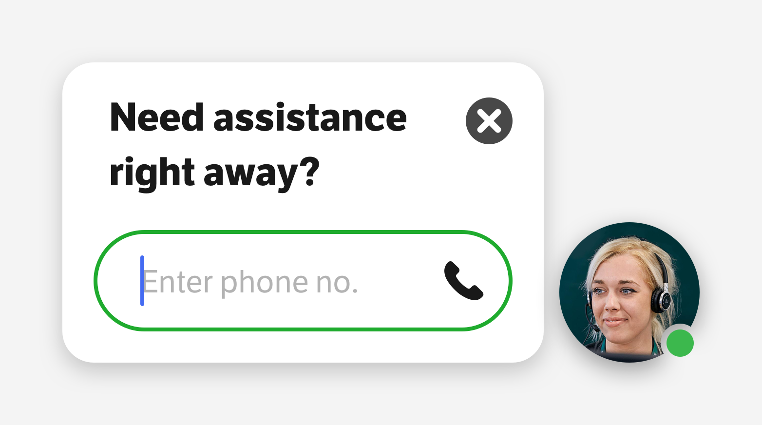
The new design got rid of all the weight and clutter of the old banner while introducing a human presence reflecting the eagerness and helpfulness of the customer support representatives. The concept took inspiration from social media patterns where a circular avatar along with a green dot signifies that there’s an available human being on the other end. The new design would also persist even if closed, so that the user would have a second chance of reaching out for help after they had spent a few minutes getting an overview of the content of the page.
To prove that the new design could outperform the old design we launched an A/B test on two of most visited sales pages of yousee.dk After running for two weeks the incoming results were astounding, showing that the new design seemed to cause no less than 100% increase in conversion! From that moment on the business quickly made sure it was rolled out on all sales pages of the website.
This process was later highlighted as an ideal example of a data-driven design decision and was presented on many occasions in various parts of the organization.
Employer
Role
- UX Designer
Design Methods
- Wireframing
- Prototyping
- UI Design
- Animation Design
- User Testing
- A/B Testing


